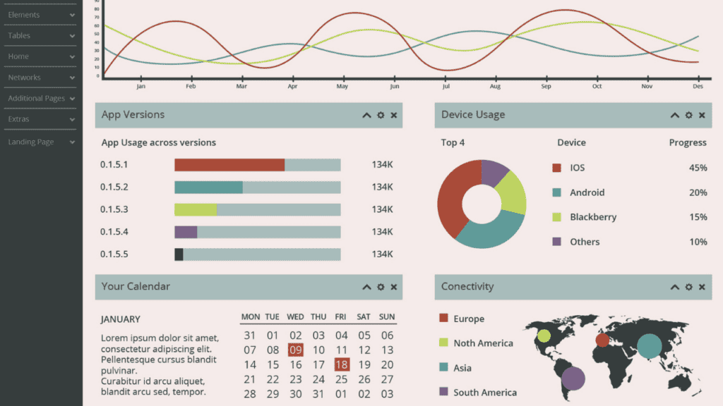
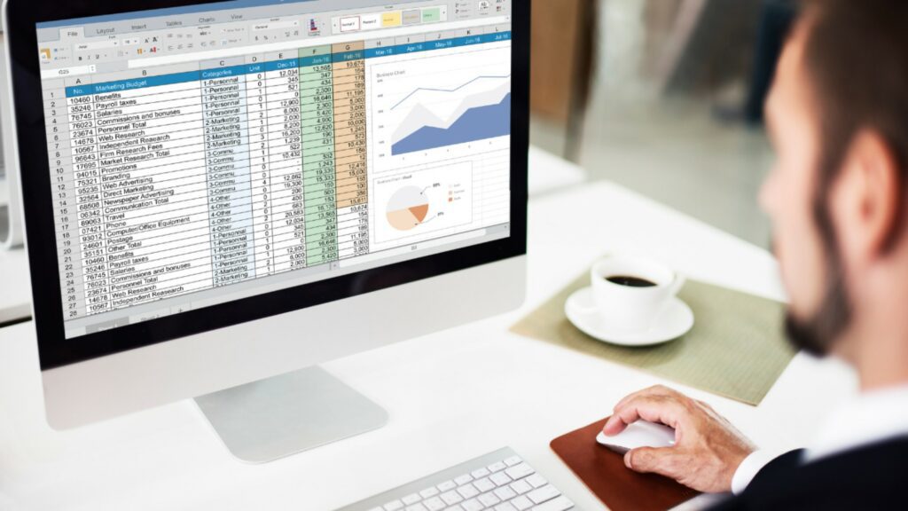
Transforming raw data into actionable insights that can drive clear, informed decisions – at all levels, is what Power BI Data Visualization is all about. From detailed report preparations, to single-page interface to predict future trends, Power BI Data Visualization accurately answers WWH – what data to interpret, when to make necessary changes and how to achieve with means that can amplify both the output and the desirable action.
If you’re a senior executive, responsible for making important decisions for an organization, you cannot just make decisions at spot without data to back it up. You also cannot make decisions recommended by someone else. You need to make decisions that you can justify. How? Power BI Data Visualization allows the visual representation of the data in forms of charts and graphs, that helps you analyze, and make informed decisions that you can justify and explain to your colleagues – Why you think the company needs structural changes…, and stuff like that. All can be enhanced with proper utilization of Power BI Data Visualization tool.
Why Effective Power BI Data Visualization Matters
Let’s understand this with WWH, into why Power BI Data Visualization matters.
What Data to Interpret:
Power BI has the unique feature to integrate data from different sources. Be it from excel sheets, My SQL database, Mailchimp, and more, Power BI can seamlessly integrate data and represent on its interface, all while allowing teams from different regions to collaborate at the same time. The data is then cleaned and transformed into interactive dashboards and reports to identify key insights.
When to Make Necessary Changes:
Since Power BI is a cloud-based business analytics tool, real-time updates or modifications, enables the data-users to track changing performance and anomaly in trends.
Let’s say, you are a reputable bakery shop, with several chains across US. You are using Power BI to track sales. Suddenly sales track across one of your chains, drop significantly. Power BI alerts a trigger, which then the management tries to address.
Is it because of a new competitor in that region? Is it because there is a stock shortage or maybe some technical issue like payment problems? The management will then try to address the issue – either by conducting surveys to find the cause, or if they already know the cause, they can start implementing corrective measures accordingly.
The approach will differ from company to company, but data interpretation and it’s enhanced presentation with Power BI will enable management to make informed, practical decisions.

How to achieve actionable results:
The advanced analytics and AI-driven insights, alongside user-friendly visuals, empowers businesses to explore data efficiently and implement strategies that drive desirable outcomes.
Should the cake shop employ professionals to solve the technical issue, should they change marketing tactics or maybe start redistributing more stocks to that region. The Power BI Data Visualization ensures the right decision is made every time, tailored and customized to meet the business’s unique KPIs and demands.
When power BI bridges the gap between raw data and actionable insights, it is this visual feature of power BI, that helps user interpret data and make informed decisions. The visualization plays a critical role in either providing accurate information with clarity or confuse the audience with unnecessary, over-complicated visuals that causes misinterpretation.
Let’s dive into the top 10 best practices for crafting impactful Power BI visuals.
10 Best Practices for Power BI Data Visualization
Understand Your Audience and Goal
Before starting with Power BI Data Visualization, you need to first understand who is going to use this dashboard and what are they trying to answer. If the dashboard is made for the cake shop’s management team- responsible for effective sales without bottleneck in any of its process, then you need to prepare detailed reports alongside sales navigation dashboard.
If it’s for senior executive, responsible for important decisions directly impacting the organization, then you need to make an interactive dashboard with consistent color palate, providing summarization of data to predict future trends. Tailor the visuals, based on need and the ultimate goal.
Choose the Right Power BI Visuals
If you want to analyze the growth pattern and compare it with past years, then opting for pie or line chart will not only be an impractical choice, but also, will dilute the entire purpose. Choosing the right Power BI Visuals require the alignment of visual elements to the purpose and goal of the target audience. Here are some guidelines:
- Use bar chart for comparison
- Opt for line chart to show trends over time.
- Leverage heatmap for identifying patterns in large datasets.
- To show geographical data, go for maps
- Be mindful while using visual elements, as too much can lead to cluttery data presentation that will deviate the purpose of the data.
- Be minimalist and opt visuals that are necessary and best represents the data set.
If the cake shop wants to compare its sales across different chains against the past year, then the data analyst can opt for bar chart. If it wants to show changing trends, then it can go for line chart. If they want to analyze what regions people are actively engaging and visiting the stores, then go for geographical data – gathering raw data from online reviews and the platforms such as Yelp and Google My Business profile.
Visualization is an art and a science and Power BI Data Visualization symbolizes this very aspect.
Simplify and Focus on Clarity
As mentioned in the above points, the data visualization should be kept as simple as possible – allowing the readers to skim and not read.
Both in-terms of visual presentation of data, and data itself, the analyst should remain minimalist, using visuals when required and summarization of data, rather than presenting the detailed data description that serves no value, when you are trying to make timely informed decision.
Focus on clarity of the data presented; it should be clear and understandable by humans. Remember, you are creating an interactive dashboard visualization for novice readers, and not some experienced professionals that can easily comprehend the data presented. Include proper gaping after major sections for better understanding. This enables the reader to understand the main insights and make insightful decisions, while being time-bound.
Use Colors Strategically
Use consistent color to represent a particular data set. Colors can enhance the readability of the visuals, but if made a rainbow – will distort the interpretation of the data. Then, it will be same as the raw data, which you refined for better understanding, but since there is an irregularity in the color palate then its as good as the raw, un-refined data, making no sense.
Maintain consistency in the format, design and layout, enabling consistent user-experience throughout every component of the dashboard. Highlight the key data with contrasting colors and ensure to adhere to common color analogies.

Slicers and Filters for Data Analysis with Power BI
Slicers and Filters are important tools in Power BI, that enhance data analysis by enabling users to focus on specific subsets of data and interact with reports dynamically.
- Slicers
Slicers are the visual controls that are directly added to the power BI reports. It allows the user to:
- Select certain values to update visuals dynamically.
- Interact with multiple visuals simultaneously, making it easier to analyze data from different perspectives.
Let us understand this using the same example: The Cake Brand with multiple chains across the United States. When management notices a large fall in revenue, they can add the slicers – “Region” and “Store.” within their Power BI Dashboard to evaluate what regions are not performing well. They can also include “Product Category” slicer, revealing, let’s say -custom cakes are not performing well in that region.
This dynamic analysis within the same dashboard, just one click away – allows the management to target specific stores and products, identifying and addressing the underlying issues.
- Filters
Filters, on the other hand, refine data at different levels—report-wide, page-specific, or individual visuals—allowing for more targeted analysis.
In the same scenario, a filter can be applied to focus on sales from the last quarter or exclude locations where promotions were active, allowing the team to narrow their analysis to unaffected stores.
Using this insight, the management can make critical decisions. For instance, they might decide to close the underperforming chains to reduce costs. Alternatively, they could redirect their resources to invest in high-performing stores, making them even bigger and more successful by offering additional options.
Slicers and Filters enables the management to dynamically adjust their analysis, allowing the businesses to focus on the most relevant data and implement effective strategies quickly.
Power BI Dashboard Examples as Inspiration
Studying successful dashboards can spark new ideas and help you refine your design that meets the goal and objectives of a particular organization.
Let me tell you about a high-end restaurant that approached Corient to measure its primary KPI’s real-time. The restaurant was struggling to discover their true profitability and operational efficiency after subtracting all expenses. Corient started with first analyzing the problem which was – the lack of centralized system to monitor KPIs, and a rigid multiple disparate data sources that further added complexity to consolidating and analyzing information.
The Corient Solutions were –
- To Design a well-structured, documented plan to implement Power BI reports using their existing data sources.
- Developing custom dashboards to track revenue and operational costs.
- Integrate data from multiple systems into a unified platform, and
- Creating an optimized data model for efficient data retrieval and processing.
It will be a fallacy to say that Corient did not face any problem. But the handover was a flexible scalable solution that exceeded the restaurant owner’s expectations. In no-time with corient’s Power BI solution, the restaurant was able to-
- track and analyze the revenue.
- Create a detailed COGS Report that provided valuable insights into operational cost and profitability.
- The stakeholders were trained to ensure seamless adoption and utilization of dashboards.
- Client was able to make informed decisions and implement strategic planning.
This project highlights Corient’s commitment to delivering tailored, impactful solutions that meet unique business requirements. To know more on how Corient helps businesses of all size with custom Power BI Solutions, read our case studies here.
Conclusion: Mastering Power BI Data Visualization
Effective Power BI data visualization is both an art and a science. By following these 6 best practices, you can create dashboards that are not only visually appealing but also highly insightful and actionable. Start implementing these tips today to unlock the full potential of your data with Power BI.
Ready to excel with Power BI Data Visualization? Partner with Corient Business Solutions to create impactful dashboards that transform data into decisions!


